


Core Benefits Of A Responsive Learning Management System
The role of the Learning Management System is rapidly changing. Modern work practices and the need for continuous professional and personal development are directing the ways we learn. The Learning Management System of today needs to facilitate and enhance learning, not dictate. More and more of us are taking control of our own learning and skills development. This is evident from the rise of:
- Social Media as a learning tool (see the following article by Christopher Pappas on Social Media use).
- MOOC's (Massive Open Online Courses).
- Informal learning (see the following article by the late Jay Cross on informal learning).
A Learning Management System is only as good as the content it helps deliver and the data that it can provide regarding Learning and Development (and other) performance initiatives. For users to engage with your Learning Management System it must fit into the way that they learn and develop skills. Having a responsive Learning Management System is a key factor to consider when determining the best fit for your organization or association.
The medium for delivering learning (Learning Management System) should not be the focal point. Instead it should act as the silent conduit and facilitator for learning and skills development.
What Is A Responsive Learning Management System?

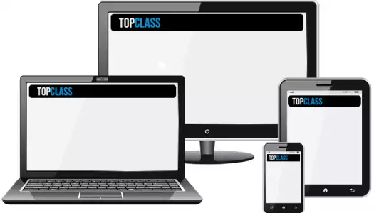
A Responsive Learning Management System will employ a Responsive Web Design (RWD). This approach provides an optimal viewing and interaction experience —easy reading and navigation with a minimum of resizing, panning, and scrolling— across a wide range of devices (from desktop computer monitors to mobile phones).
This article looks at the following critical success factors which you can meet by having a Responsive Learning Management System:
- The Multi-Screen World.
- Mobilegeddon.
- Web Search Trends.
1. The Multi-Screen World.
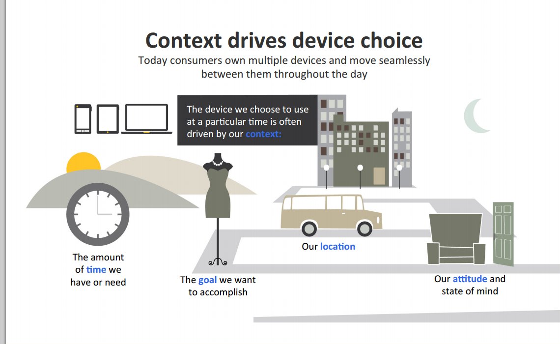
A study conducted by Sterling Brands and Ipsos, in conjunction with Google (2012/2013), found that we now live in what can be called a Multi-Screen World.
90% of people move between devices to accomplish a goal, whether that’s on smartphones, PCs, tablets, or TV.
Research from this study shows that:
- There are two main modes of multi-screening:
- Sequential screening where we move between devices.
- Simultaneous screening where we use multiple devices at the same time.
- The device we choose to use is often driven by our context:
-
- Where we are;
- What we want to accomplish; and
- The amount of time needed.
-
- Smartphones are the backbone of our daily media interactions. They serve as the most common starting point for activities across multiple screens.
- Multiple screens make us feel more efficient because we can act spontaneously and get a sense of accomplishment – this results in a feeling of "found time".
What this means for your Learning Management System is quite clear: Users have to be afforded the ability to continue their learning goals at home, and on the move - at the time and location that suits them best.
2. Mobilegeddon.

In case you missed it, on 21st April 2015, Google announced that it was rolling out changes to its SEO algorithm (otherwise known as Mobilegeddon). The changes made rank mobile friendly pages found in mobile searches higher than other non-responsive pages. This means that organizations that have sites that meet Google’s mobile standards will rank higher in search results on phones.
The aftermath of these changes (a little like Y2K) have not had the catastrophic effects anticipated by many. Mobilegeddon does however point to the importance of having a mobile-centric approach. Your Responsive Learning Management System should be designed with mobile first in mind. This approach plans for the small screen first.
3. Web Search Trends.

For the past couple of years it has been rumored that mobile web usage has outstripped that of desktop. This has finally come to pass in the third quarter of 2015. Google (soon to be known as Alphabet) has confirmed that searches on mobile have outstripped those of the desktop for the first time.
If the users that make up your organization or association are moving to performing the majority of their day-to-day tasks on mobile device - your Learning Management System has to move with them. Users should be provided with an enhanced learning experience that has been designed to respond to their learning device of choice. Otherwise they will choose their own means to learn and up-skill. You only need to take a look at the fortunes of Nokia, MySpace, etc. to realize that it is the users’ ability to use tools and products in a useful and personally meaningful way that determines success.
Organizations that aren't aware of changes in their users’ behavior, and fail to provide an enhanced User Experience will quickly lose market share and flounder.
At WBT Systems you will find TopClass LMS - which believes a Responsive Web Design approach is essential, and that will continue to adapt itself to how its users learn.
References
- Meunier, B. (2015, May 7). Mobilegeddon Is Beginning, Not Ending. Retrieved November 17, 2015, from http://searchengineland.com/mobilegeddon-beginning-not-ending-220512
- Rao, L. (2015, April 21). What Google's Mobilegeddon is (and why you should care). Retrieved November 17, 2015, from http://fortune.com/2015/04/21/google-mobilegeddon/
- Terdiman, D. (2015, October 22). Google Says Mobile Search Has Surpassed Desktop Search. Retrieved November 17, 2015, from http://www.fastcompany.com/3052654/behind-the-brand/google-says-mobile-search-has-surpassed-desktop-search
- Webb, P. (2012, September 16). The New Multi-Screen World: Understanding Consumer Behaviour - Mobify. Retrieved November 17, 2015, from http://insights.mobify.com/the-new-multi-screen-world-understanding-consumer-behaviour/